Imagine you’re working on a lettering project and suddenly you need to scale your piece into a bigger size. And you’re using a raster file. OMG, what do you do now?
Will you need to redraw everything so it doesn’t look pixelated? Will you just have to work with a low-quality file? Well, the key is knowing where and how you’ll use your artwork before setting anything up. You’ll have to figure out which format and sizes you’ll need for the project you’re working on beforehand.
Raster vs. Vector: these are two different types of files that you can use to create lettering. But do you know how they differ? In this article, I’ll break down the key differences between the two. This will help you decide which format best suits your lettering project.
Note: This post contains affiliate links, which means if you happen to purchase something, I’ll make a small commission at no extra cost to you! See my full disclosure here.
What is a Raster File?
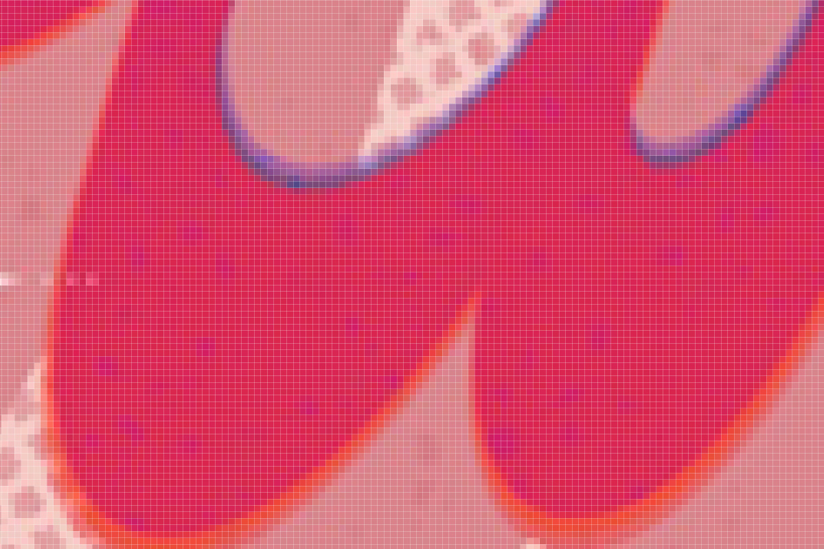
A raster file is an image that is made of pixels only. Think of it as an image that contains a bunch of little squares to form the entire picture. If you zoom in on any raster image, you’ll be able to see these little blocks of pixels that compose the image.
The most common formats for raster graphics are JPG, PNG, GIF.
What is a Vector File?
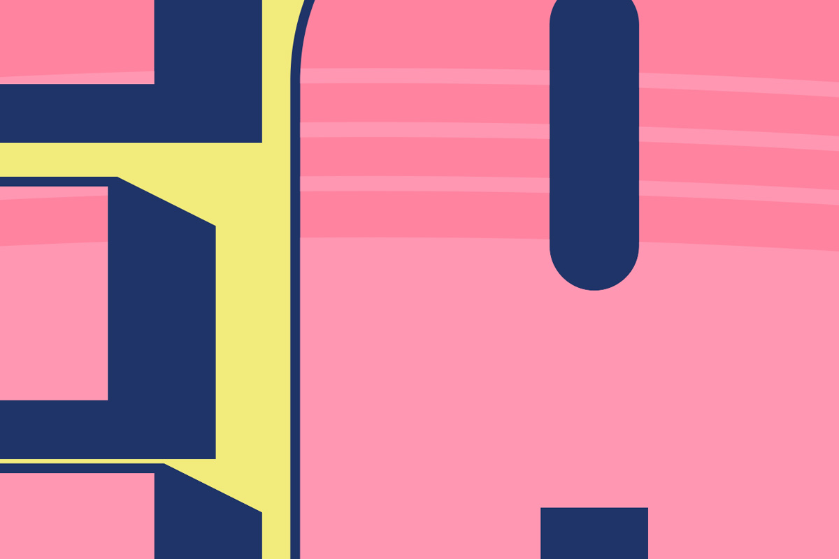
A vector file is an image made of mathematical equations. Wait, what? Math? If you hate math as much as I do, don’t worry about it. You won’t have to do any of the math yourself, as the vector software (such as Adobe Illustrator) will handle that part for you. This simply means you can scale up your lettering work without losing quality.
Vector graphics are most common in these formats: AI, EPS, SVG.
Raster vs. Vector: What Look Are You Going For?
Do you want a polished, clean look for your lettering piece? Or do you want to work with textures so it feels way more hand-drawn? Or maybe you really want to work with watercolors, gouache, acrylic paint, or any other tool.
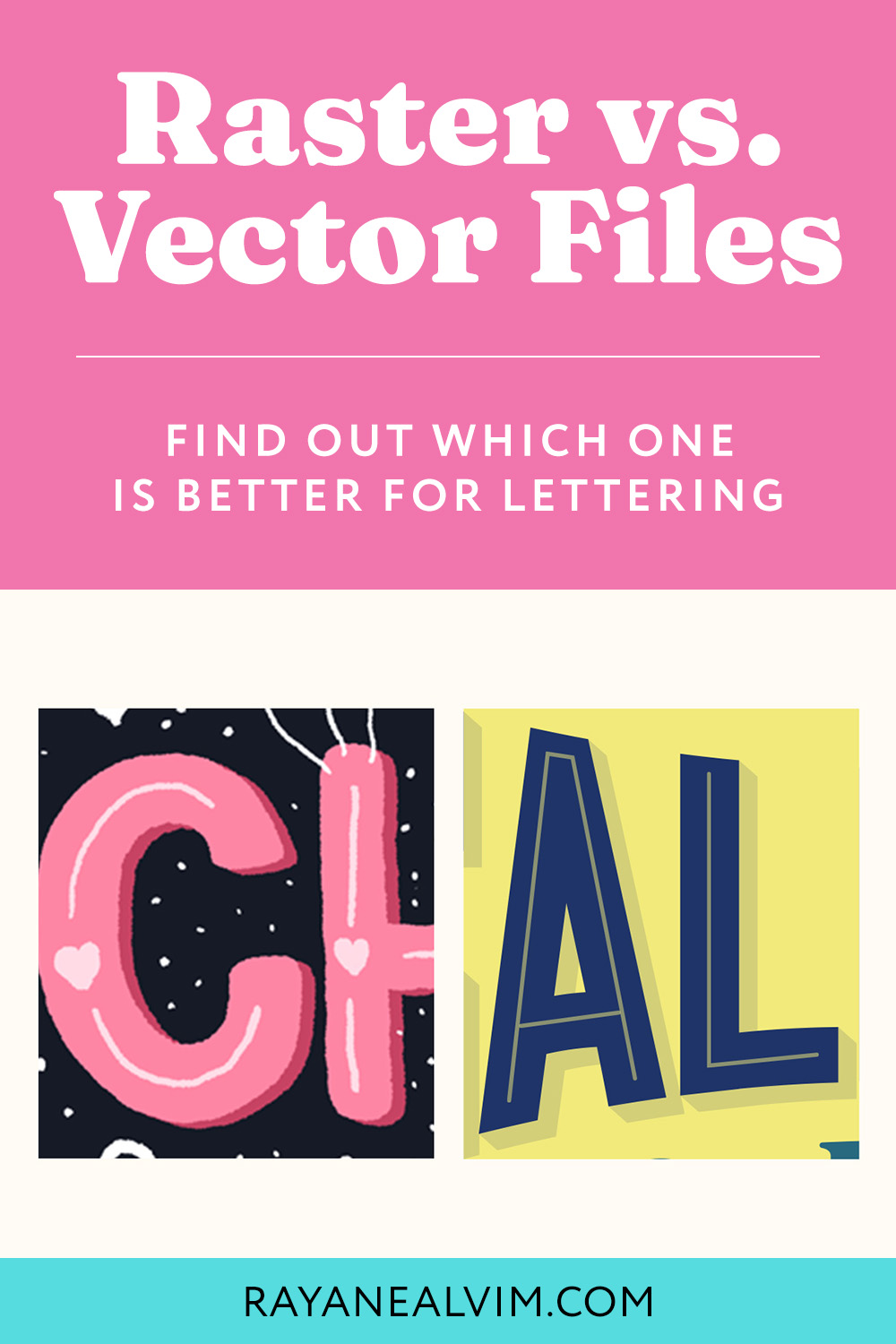
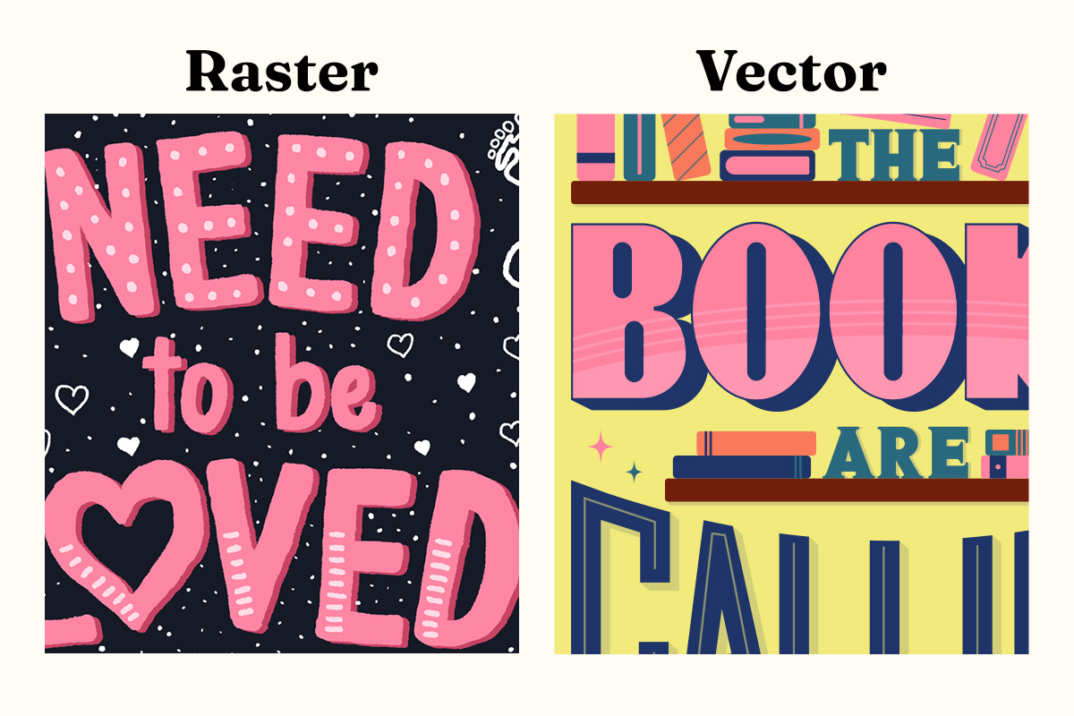
You’ll have to decide what look you’re going for. That will inform your decision best. Because if you want clean lines, it’s better to work with vectors. But if you’re going for a hand-drawn look, then raster will be the best choice for your artwork.
The differences between Raster and Vector
The biggest difference between raster and vector graphics is the fact that a raster file can lose quality if you need to resize it to a bigger size. Meanwhile, vector files can be scaled up and down without losing any quality.
Resolution
If you’re working in a raster program such as Photoshop or Procreate, you’ll have to be mindful of your resolution. You want to make sure that your artwork has enough resolution so it can be used in a bigger size. Say you want to use your piece on a product on print-on-demand sites such as Redbubble. Some of the products there need bigger sizes so they can be printed with great quality.
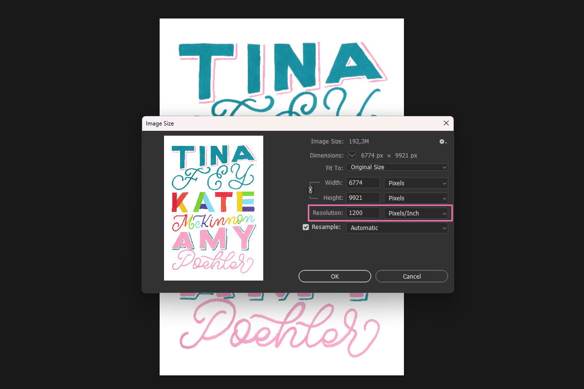
For optimal results, aim for a resolution of at least 600 DPI (dots per inch – which refers to how many ink droplets a printer produces per inch, or how many details the scanner will capture), although I recommend going as high as 1200 DPI. However, Procreate has some limitations when it comes to DPI. For example, I like to work with the standard A3 format and if I choose 1200 DPI, it often results in the program flagging the file as too large.
If you’re creating artwork on paper, scanning it at 1200 DPI instead of the usual 300 DPI default setting will give you a higher resolution. By doing this, you’ll make sure that your file is suitable for printing in larger sizes without compromising quality.
Editing Flexibility
Vector files have great editing flexibility because we can resize our designs without any loss of quality. In contrast, raster files can become pixelated when scaled or when you move things around, resulting in more work as you’d have to redraw or recreate elements to keep them sharp.
Hand-drawn x Digital
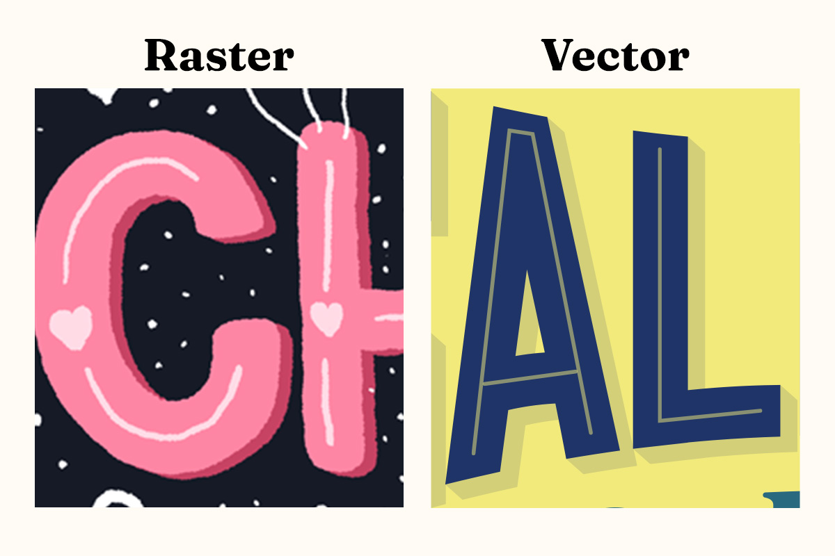
One of the great things about working with raster files is the hand-drawn factor. Whether you’re scanning your analog lettering pieces or using a raster program such as Procreate, you get that handmade feel in your artwork. With raster, you can work with textures and pixel brushes, which can make your work feel much more hand-drawn.
Vector files, however, make your lettering look cleaner and look way more digital. While you can certainly mimic some textures with vector brushes and effects, it’s not quite the same thing. So think of vector files as more of a crisp and sharp look.
Print or Digital
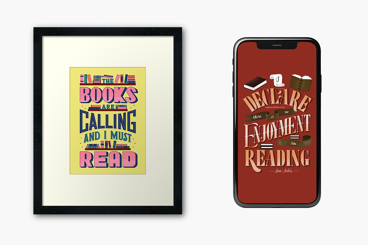
To decide if you need to work with raster or vector files, you need to figure out where your piece will live. Are you doing some lettering for social media or web only? Then working with a raster software will be just fine. Will you need to print it in different sizes? Using vector is your best choice here.
It can also depend on your preference. Do you like working with clean lines or do you like working with textures for more of a hand-drawn look? If you want more precise and crisp lines, work with vectors. If you want handmade, work with raster.
That is not to say that you can’t print raster files, but when you’re working with them you have to make sure your file has enough resolution so you can print it in bigger formats.
Choosing the Right Software for Raster and Vector Lettering
When working with raster files, the most popular softwares are:
- Procreate
- Photoshop
- Adobe Fresco
- Clip Studio Paint Pro
For vector files, these are the most common ones:
- Illustrator
- Inkscape
- Adobe Fresco
- Affinity Designer
Raster vs. Vector Files: Which one is better for lettering?
There is no one-size-fits-all. It will all depend on the project you’re working on. If it’s a personal project, you can decide which format you like the best. If it’s a client project, then you’ll have to follow the brief and make sure you’re aligned with your client’s expectations.
I’m a big vector girl but ever since I started working with an iPad, I’ve been more drawn to working with textures and pixel brushes for more of a hand-drawn look – and you can see a comparison of two of my favorite iPad apps here. But I don’t always use raster for all of my pieces. It really depends on what I’m going for. Just make sure your resolution is big enough for larger printing (you never know when you’ll need to scale up a design) and you’re good to go!
