
I started learning lettering because I wanted to create unique stuff. I didn’t want to use the same fonts over and over again (every designer has thousands of fonts but we only ever use our favorites, which are like, 3 fonts.) I also wanted that handmade feeling: not using my computer for everything, actually sketching on paper and creating something by hand. It gives personality, originality and it shows that not everything is perfect, that you actually took the time to create something unique that no one could ever reproduce by just downloading the font and putting it in Photoshop. That’s why ever since I started learning lettering, I wanted to create my own personal hand-lettered logo. In this post I will guide you through my process for creating my personal logo: from paper to digital.
As I started to brainstorm what I wanted for my logo design, it was very clear to me that I needed something in a script style. I came up with this idea because when I started practicing hand lettering, the first thing I learned was calligraphy. I learned all about the basic strokes – downstrokes, upstrokes, ovals, compound curves and all everything else. I learned how the downstrokes have to be thick, the upstrokes have to be thin, ovals are hard when you’re first starting and much more. I did all my practice with a brush pen or a paint brush and that gave me a huge idea of how to draw script letters.
The Research
After I had a clear idea of what I wanted in my mind, the first step was to research. I created a Pinterest moodboard full of references and inspirations. I gathered many script style references, from fonts to hand-lettered logos and quotes. The point here was to get as many references as I could from things that aligned with my own concept.
Creating the Thumbnails
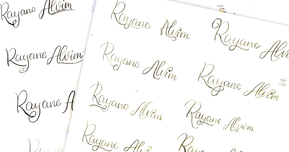
After gathering all the reference I needed, it was time to finally start sketching the actual logo. I started by making many thumbnails. This is a great way to see how the words will actually go together, how the composition is going to look. This is not a final sketch yet, this is simply writing out the words so you can have a visual idea.
The Sketch
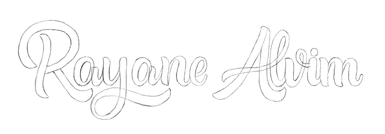
Now it’s time to actually start sketching the letters. It’s time to go bigger so you can have the chance to look at your words and see how the whole thing is looking. This is not a one-time thing, I created many sketches and I traced over them with tracing paper to fix the mistakes.
The Inked Version
After refining the sketch, it was time to pick up my micron pen and trace over the sketch. I like to trace it with tracing paper because if I mess up at some point, the paper with my sketch version is still intact and I can start all over again to fix anything.
Vectoring the Logo in Illustrator
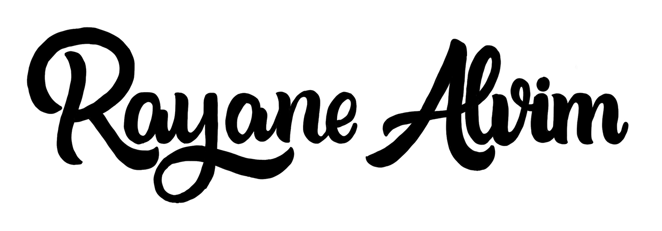
At this point, it’s time to go to the computer and start creating the full-vectored piece. I always scan my lettering pieces at 600dpi so I can have a high resolution. I then bring it to Photoshop so I can clean up guides or extra mistakes that could appear in the piece. I also bring up the levels in Photoshop so the blacks are really black and the whites are really white. Then I use the Pen Tool to trace the letters in Illustrator.

Tagline
I also created a tagline for my logo because I wanted to describe the services that I provide: lettering and illustration. The tagline was also hand-draw and vectored later in Illustrator.

Supporting Illustrations
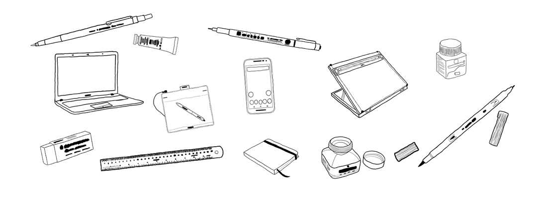
For my website and social media headers, I wanted to create some illustrations so I could insert them around my logo. The illustrations have everything to do with I do on a daily basis: the materials that I use the most: pens, pencil, drawing tablet, eraser, ruler, notebook, portable drawing board, inks and smartphone. I drew these illustrations directly in my drawing tablet in Photoshop because I wanted more of a raster look than vector. For the colors, I decided to go with my go-to color: lilac! I’ve realized that over the years I tend to use lilac/purple whenever I had to talk about myself. So it was only fitting that I choose this color to represent me and my own brand.
The Final Result
The final result is everything I ever wanted: a unique hand-lettered logo, consistent with the concept I wanted to portray: warm, youthful, classic. The illustrations add just a touch of fun and vibrancy to my brand.


