Have you ever struggled with the letter A while drawing it? Something feels off about it but you’re clueless on how to fix it. Don’t sweat about it, I’m here to help.
I’ll break down the process of drawing the letter A in this easy-to-follow guide. This includes drawing it in several different styles. Grab your pens and papers (or iPad and Apple Pencil) so you can follow along!
Table of Contents
The Anatomy of the Letter A
Before we start with the step-by-step guide on how to draw the letter A, let’s glance at different styles so we can learn how each one is built. It’s time to get nerdy and take a look at the anatomy of the letter A.
Sans Serif A (Block Letter A)
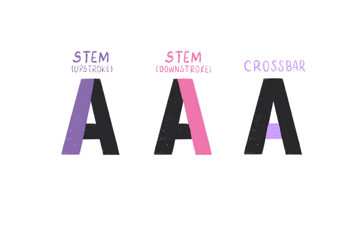
The sans serif (or most commonly known as block letter) is, dare I say, the simplest one and the easiest to draw. It consists of three strokes: 2 stems (the upstroke on the left and the downstroke on the right), and the crossbar.
Serif A
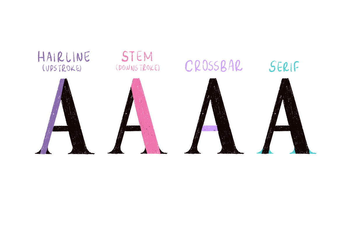
The serif letter A is pretty much similar to the sans serif but the difference is that the upstroke weight is thinner and the upstroke weight is thicker. With this basic form, you can create several other serif styles: high contrast, low contrast, slab serif, etc.
Script A
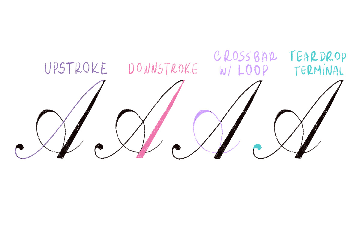
The letter A in script style can take many forms, but it mostly consists of an upstroke, a downstroke, and a crossbar. In this case, we have a crossbar with loop and a teardrop terminal. This style is called Copperplate Script.
Note: This post contains affiliate links, which means if you happen to purchase something, I’ll make a small commission at no extra cost to you! See my full disclosure here.
Tools You’ll Need
For this tutorial, you’ll only need some basic tools to get started.
If you’re drawing on paper
If you’re drawing digitally
- iPad
- Apple Pencil
- Drawing App (Procreate or Adobe Fresco)
Related: 6 Tools You Need to Get Started with Hand Lettering
How to Draw Letter ‘A’ (Sans Serif/Block Letter)
Let’s dive straight ahead and learn how to draw the number one letter of the alphabet! The first style we’re going to learn is, in my opinion, the easiest one: sans serif (or how we love to call them: block letter)
Step 1
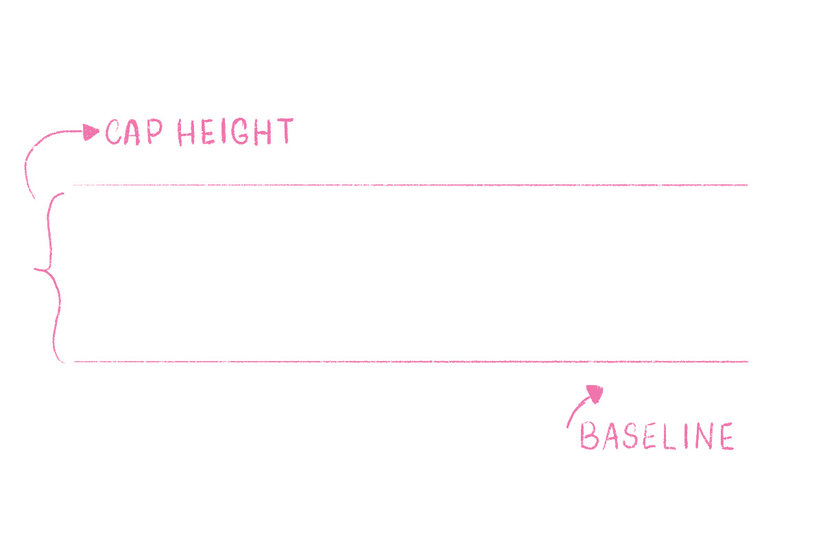
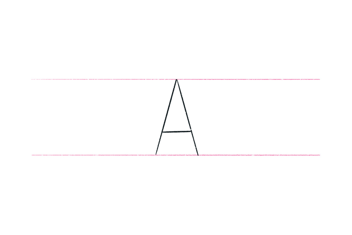
Set up some guidelines. Make sure to draw the baseline and the cap height. We’ll be drawing the capital letter A, so two lines will be enough for now. We don’t want to overcomplicate at this point.
Step 2
Draw the skeleton of the letter A first. Start with the upstroke (left), then the downstroke (right), and finish with the crossbar.
Step 3
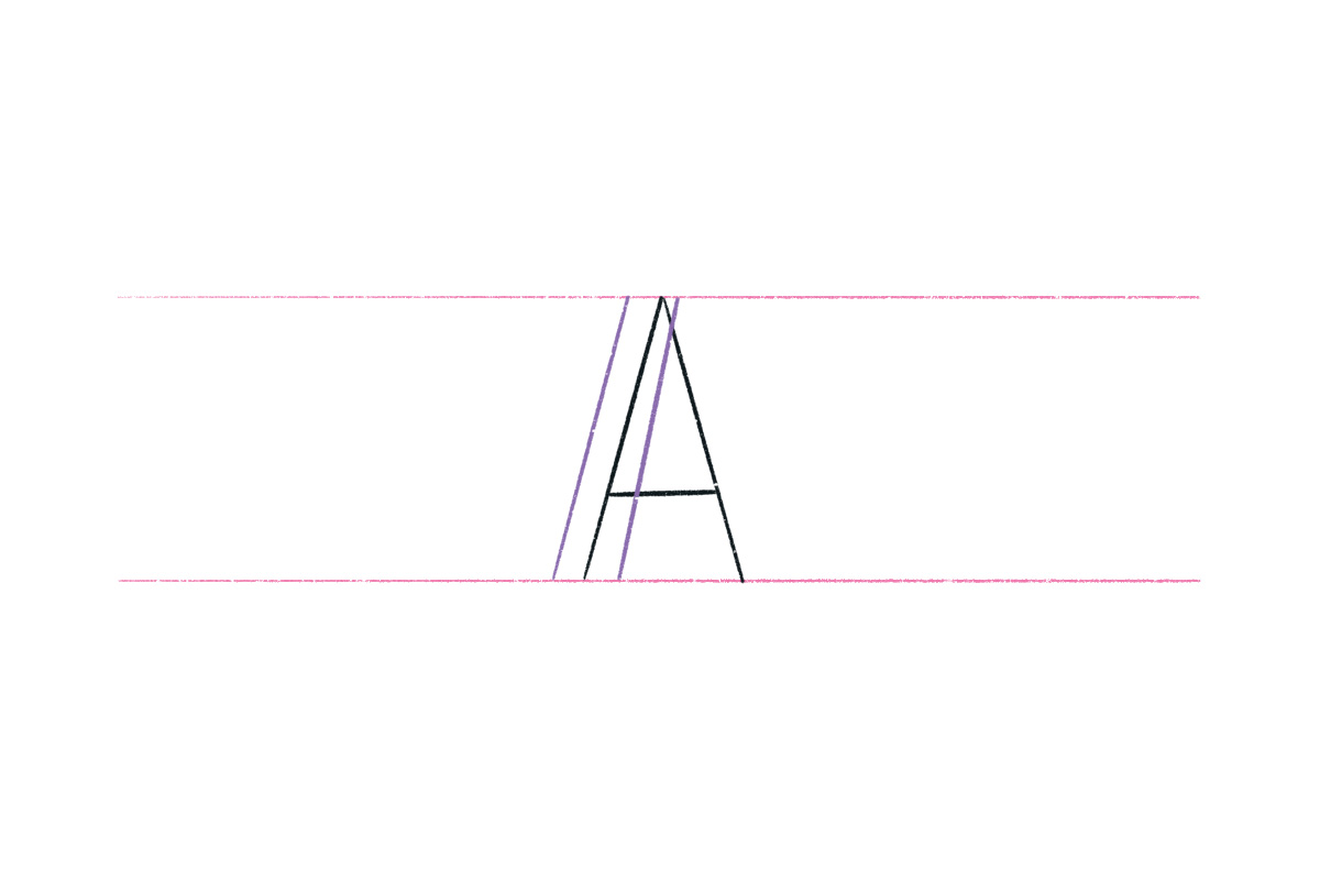
Now it’s time to add weight to our letter. Let’s add one line on the inside and another one on the outside of the upstroke.
Step 4
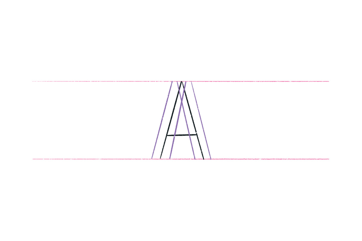
Now do the same thing for the right stroke. We’re really building the letter by drawing one line at a time.
Step 5
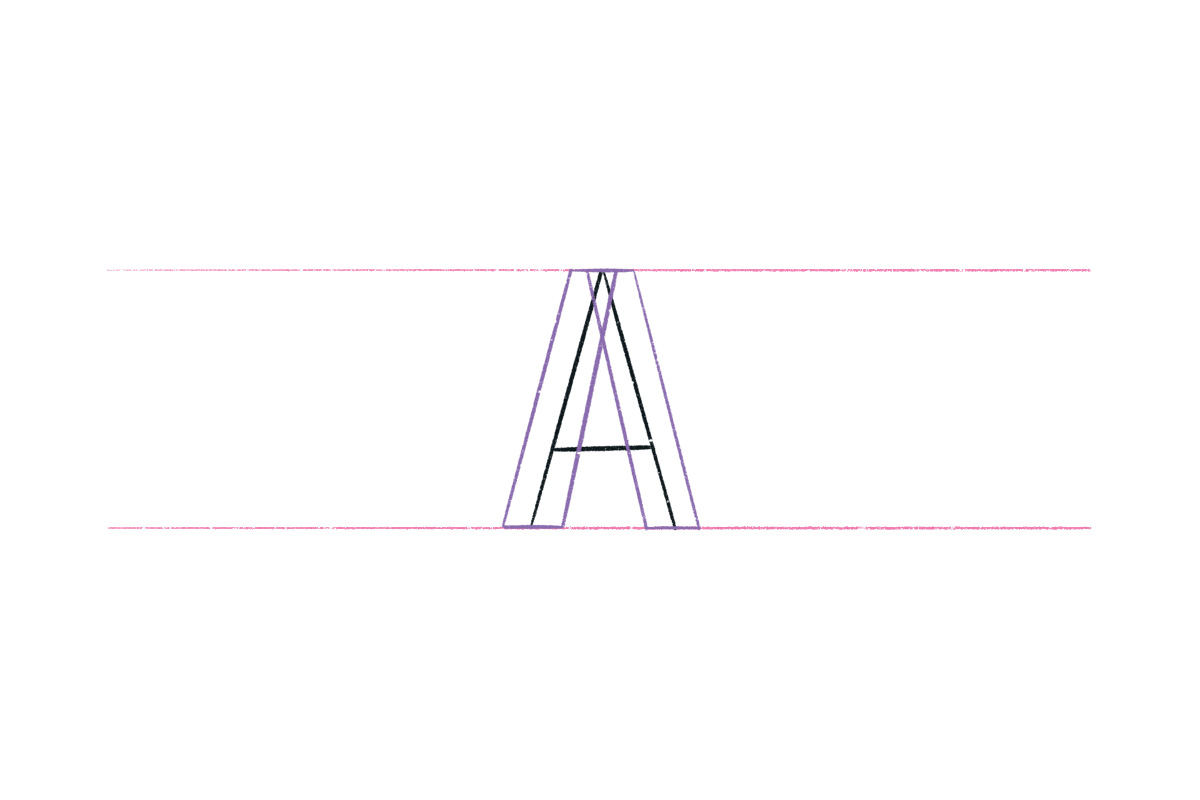
We can now close the strokes both at the top and bottom.
Step 6
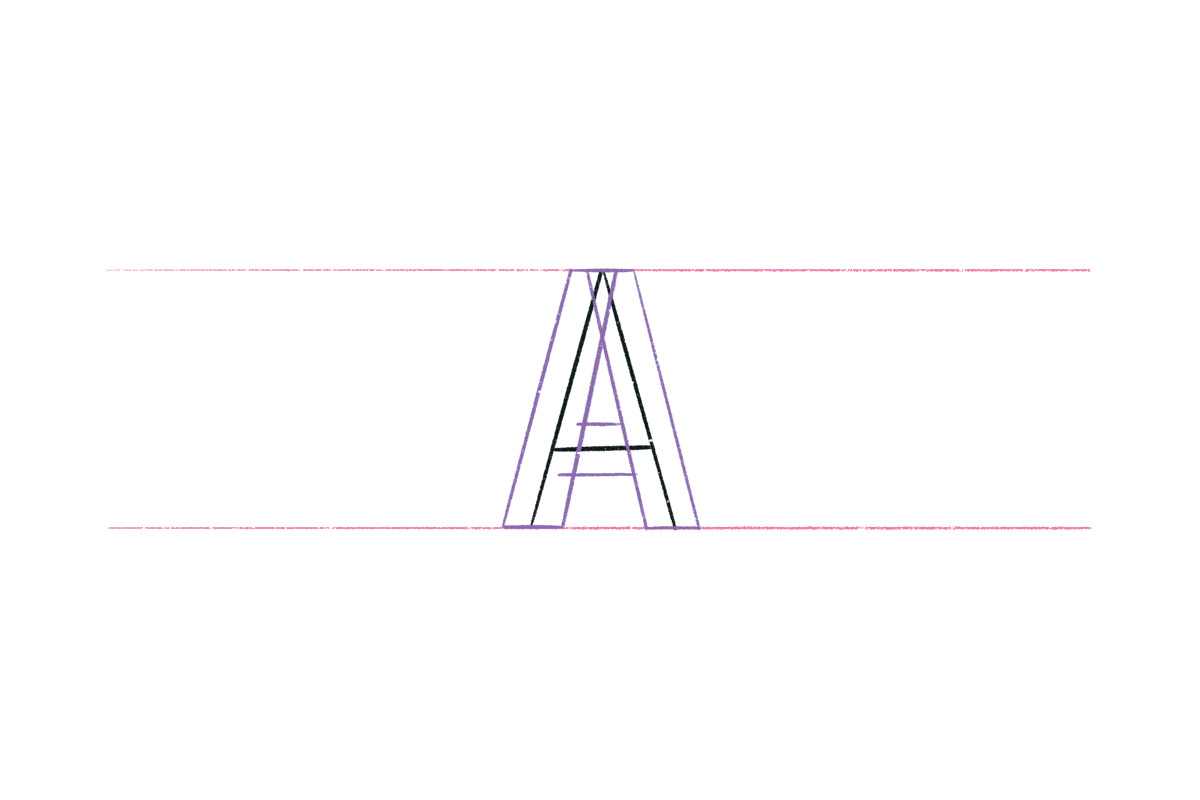
For the crossbar, we’re also going to add two lines: one at the top and one at the bottom. Remember that the crossbar isn’t placed exactly in the middle of the letter, because we need to fix it optically. You can change where your crossbar goes, depending on how you want it to look. But a good rule of thumb is to adjust it optically so the letter looks balanced.
Another thing to remember when drawing the letter A is that the crossbar doesn’t hold the same weight as the upstroke and downstroke. You have to adjust it so the weight is slightly thinner. This happens because if we use the same weight, it will look like the crossbar is actually thicker. We have to make this one tiny adjustment so our letter looks better.
Here’s how mine looks:
Step 7
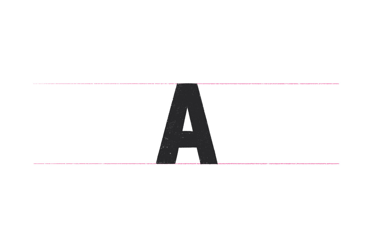
At this point, we can fill in the letter to see how it’s looking. You can now pat yourself on the back because you just drew an amazing letter A!
How to Draw Letter ‘A’ (Serif)
Now it’s time to draw a simple serif letter A. You’ll find out as you draw that there isn’t that much difference! It’s all about how and where you place your lines.
Step 1
If you’ve already set up some guidelines to draw the block letter A, you can use the same ones to draw our next style: the serif letter A. But if you want to keep things separate, just draw another set of guidelines for your letter.
Step 2
Start by drawing the skeleton of the letter, the same thing you did while drawing the block letter. If you’re drawing on the iPad, we can use the same skeleton that we drew for the previous letter!
Step 3
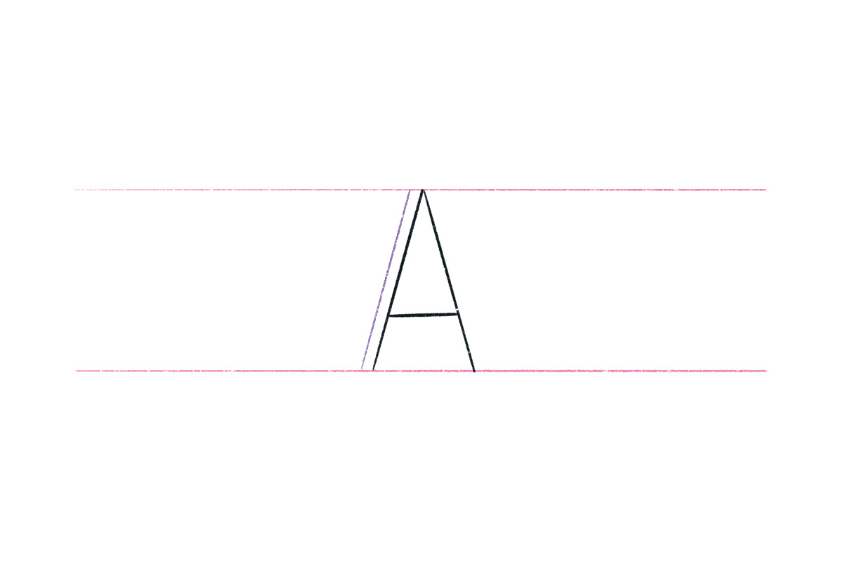
Now it’s where the serif letter differs from the sans serif one. For this letter, the upstroke needs to be thinner than the downstroke. A good rule of thumb to remember: generally the upstrokes are the thin part of the letter, and the downstroke is the thicker part.
Let’s add the second line of the upstroke on the outside of our skeleton.
Step 4
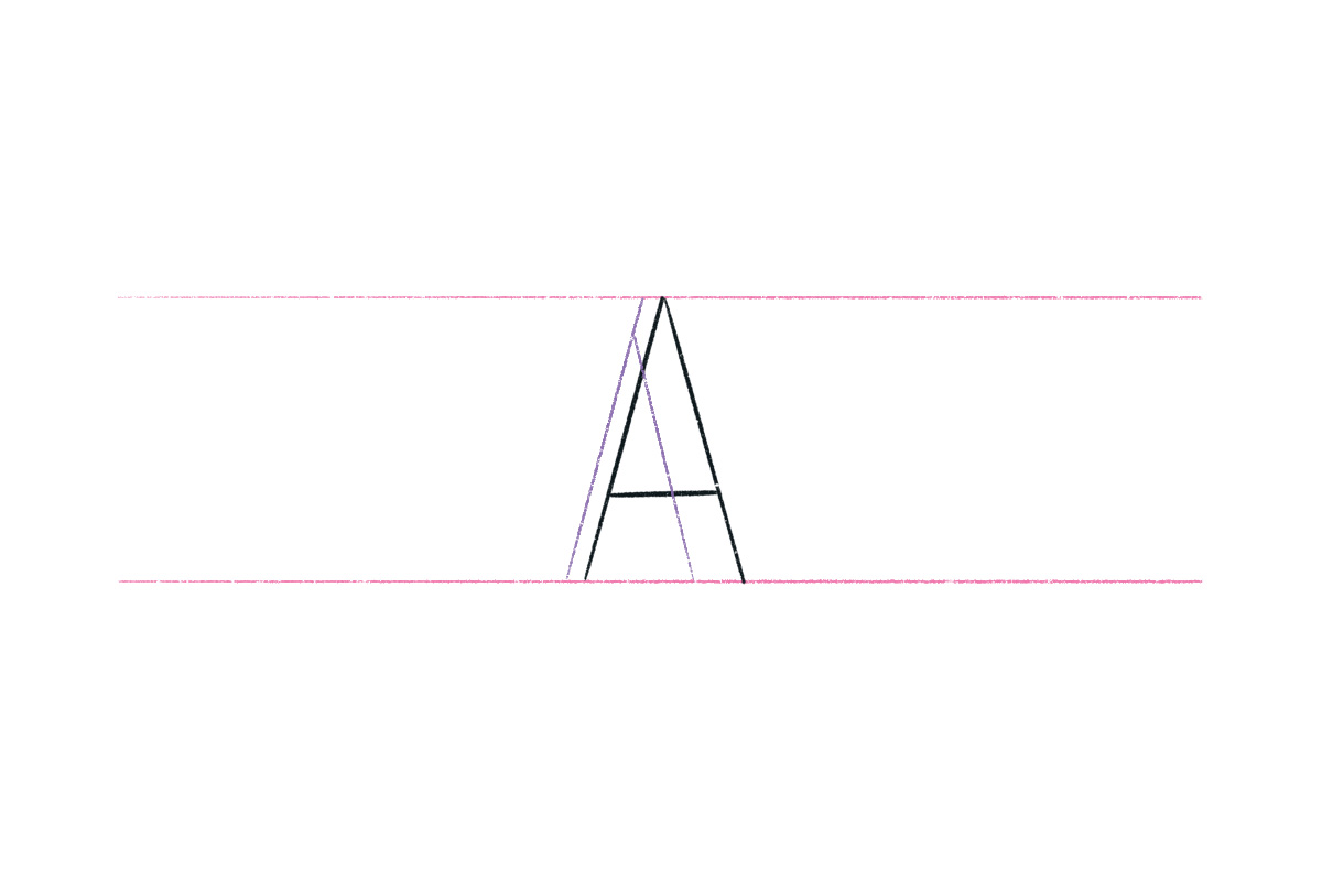
We can now add the other line of the downstroke on the inside of the skeleton.
Step 5
It’s time to build the crossbar now. For the serif letter, we also have to make optical adjustments. The crossbar weight does not have the same weight as the upstroke. It is slightly thinner than the upstroke.
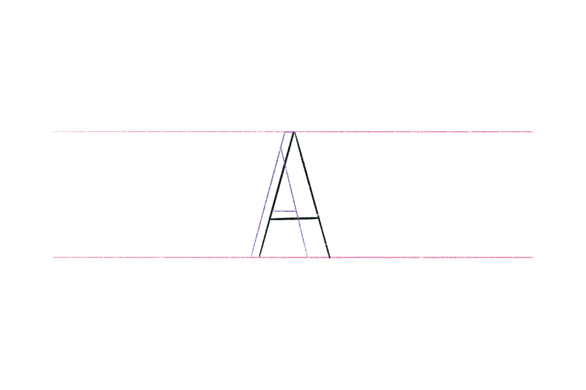
Step 6
This is where the serif letter A really comes alive: we need to add the serifs at the bottom of each stroke.
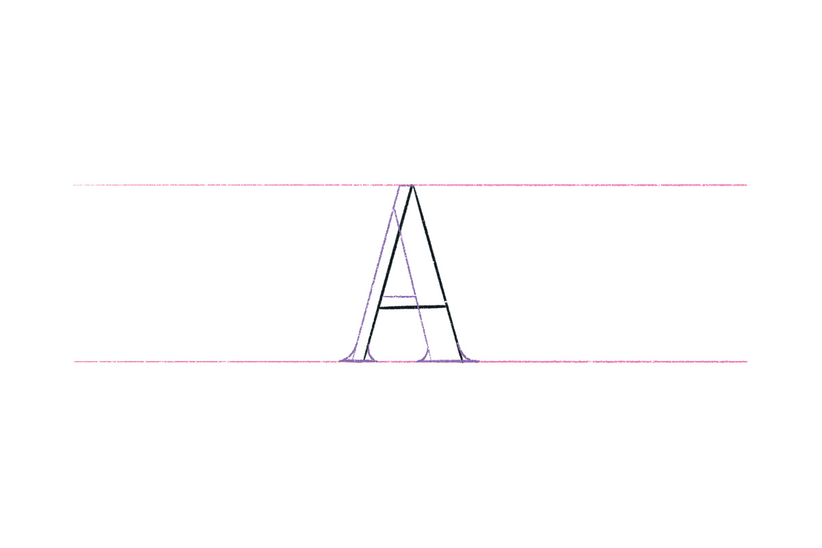
Step 6
Fill in the letter so you can see the final look of your drawing. And there you go, you just drew a serif letter A!
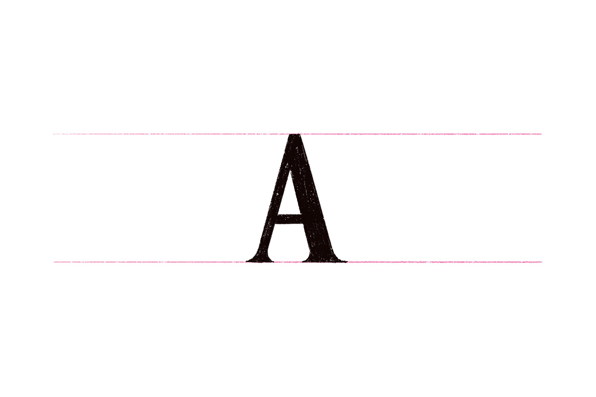
How to Draw Letter ‘A’ (Script)
There are a bunch of script styles to choose from, but here I’ll teach you one of the classics: the Copperplate Script!
Step 1
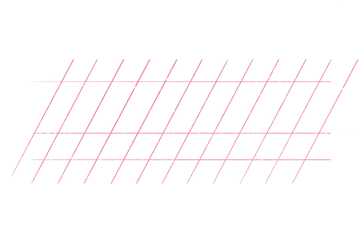
We need to draw the guidelines a bit differently for the script letter. We have to add diagonal lines because this style is slanted. I also added the x-height (the height of the lowercase letters, just for reference).
Step 2
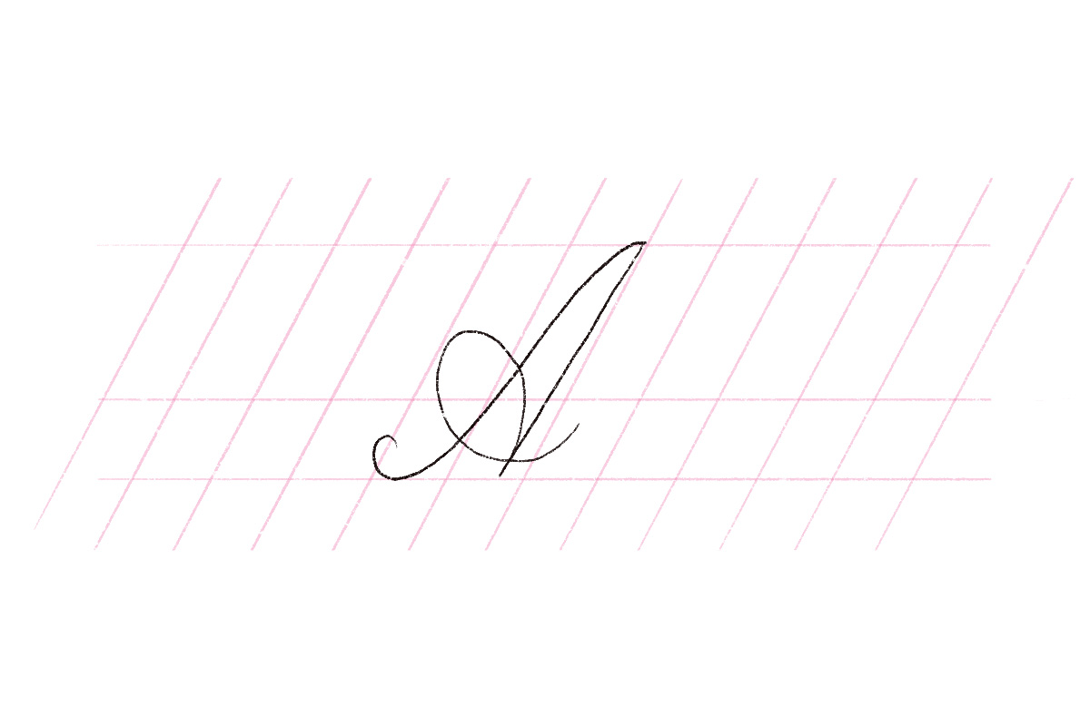
As usual, we start by building the foundation first: drawing the skeleton of the letter A in a script style. Let’s draw the upstroke and the downstroke. Then, we can add the looped crossbar.
Step 3
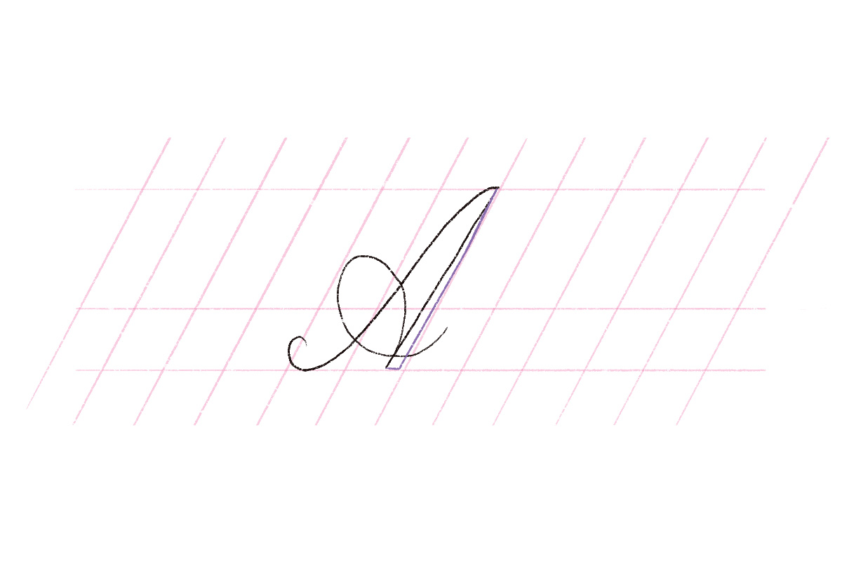
For our next step, add the second line of the downstroke. I’m using a different color here so you can see how I built the letter. You can draw it on the right side of the skeleton.
Step 4
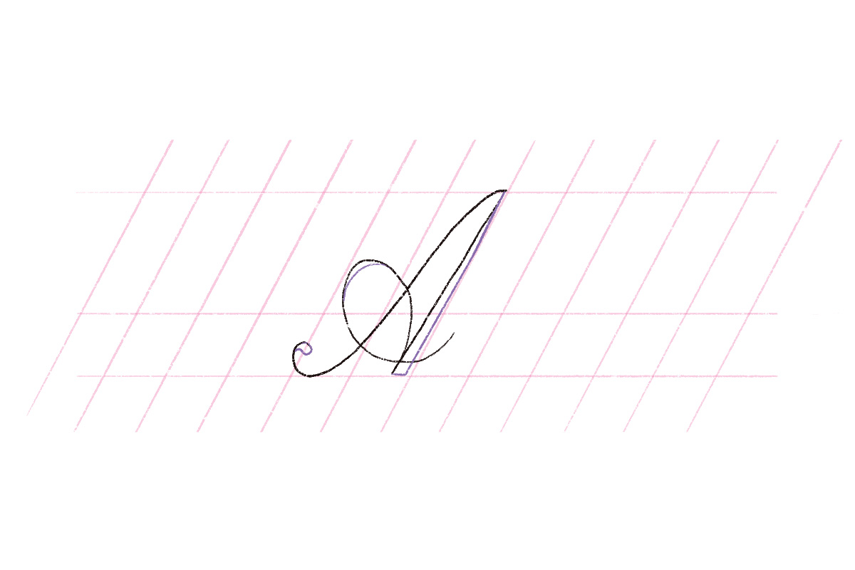
For the letter A of the Copperplate script, there’s a little bit of weight in the looped crossbar and at the top where the two strokes meet (called Apex in type anatomy). There’s also a teardrop shape at the end of our downstroke, so let’s draw those!
Step 6
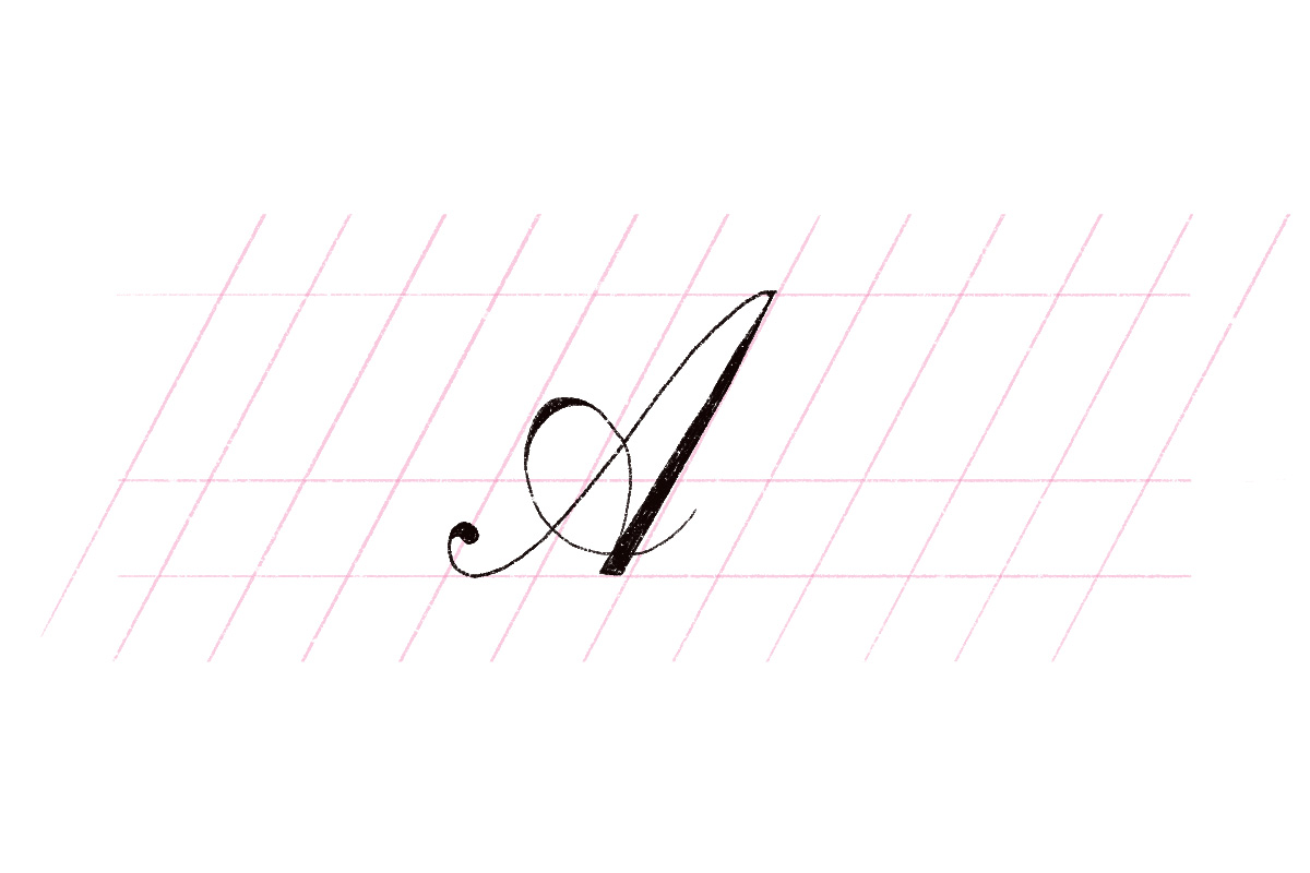
Fill in the weight of the strokes you just made. If you’re using pen and paper, you can use a pen to ink your letters to really finish it up.
Here’s our final letter A in script style:
Wrap Up
From these basic letters, you can truly build any style you want. Just let your imagination run wild and you’ll be able to draw anything. Just remember that it takes practice, so the first few times you’re drawing letters, it probably won’t look the same as mine. Just keep drawing and redrawing until you build a muscle memory. Then you’ll be able to draw any letters just from the basic shapes. Remember to also keep clear of some common lettering mistakes and you’re good to go!
Tell me, is there anything you’re struggling with while drawing the letter A? Please let me know in the comments and I’ll do my best to help you.


