

Have you ever struggled to create a color palette for your art? I’ve been there so many times! But fear no more: I’m here to teach you one of my favorite ways on how to create a color palette from a photo! It’s so much easier than you might think.
Whenever I’m creating a new piece of lettering, I always fear when the time to add color comes. Or at least, I used to fear it! Since I started creating my own color palettes, I feel like this part of the process doesn’t consume me as much as it did before.
Here’s how the process went: I would choose a color palette and wouldn’t even check if the colors worked well together. I would then get frustrated because the colors weren’t working as I wanted. I kept choosing a different color palette until I found one I liked. It used to take me so much time to finish a piece only because I wasn’t happy with the colors.
This happened until I found a way to choose my color palettes much more seamlessly. I figured out I could make my own color palette without relying on the premade color palettes I found online. They can be a source of inspiration, but I no longer use them for my final pieces.
So how can you do that yourself, you may ask?!
Learn How to Create a Color Palette from a Photo
Create a mood board
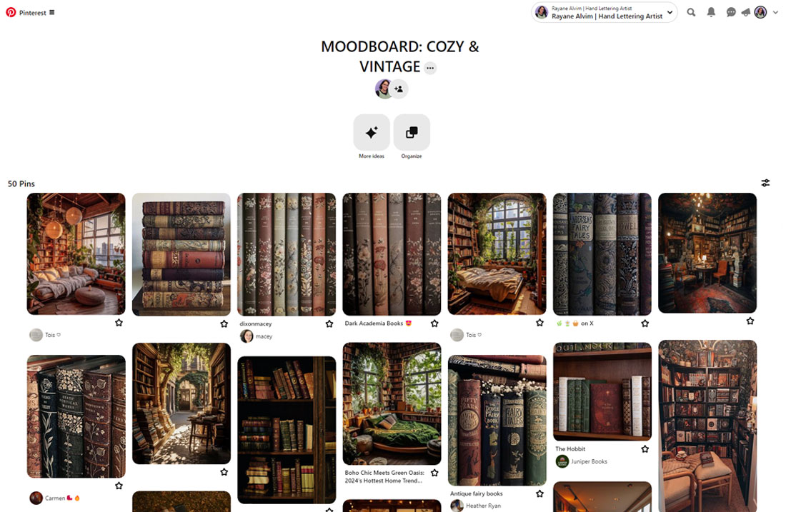
The first step on how to create a color palette from a photo is creating a mood board. I usually like to use Pinterest for this, but you can choose anything you’re comfortable with. I begin by asking myself – what mood I’m trying to evoke with this piece? Do I want it to be fun, sad, dark, clean, happy? Knowing what you want your piece to look like is a big step here.
Once you’ve decided on what you want for your piece, it’s time to gather some inspiration. I usually use Pinterest or Instagram for inspiration, but you can use any website you’d like. Is there a photography website you like? A photographer that inspires you? Any other website that inspires you? You can even use your own photos or go outside to see if anything sparks your interest!
After you’ve gathered some inspiration, you have your mood board ready. Now look at all the photos you have. Think of which one would be the best to pull colors from. Which one has a good range of colors that you could use?
You can look at the mood board I created on my Pinterest, and you can even use it to practice. For this color palette, I wanted something cozy, and inspired by fall vibes and a bit of a vintage feel to it. You’ll understand why I wanted this when I show you my final piece in the end, so keep reading!
Grab colors from your chosen photo
Now that you’ve chosen your picture, it’s time to grab colors from it! You can do this on your iPad with Procreate or Adobe Fresco. You can also use Photoshop for this. I’ll be using Procreate to demonstrate how I do it!
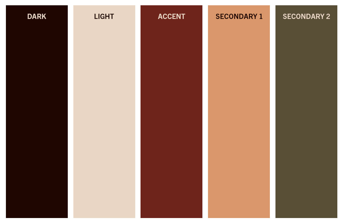
I like to work with 5 colors at a time for a palette. This is usually all the colors that I’ll need for a piece. I begin by opening a new canvas and making 5 rectangles so I can insert my colors later on.

Once my rectangles are done, I’ll insert the photo I chose in my canvas. Then I’ll start picking the colors I want with the color picker. Here’s how I choose my colors:
- 1 dark color
- 1 light color
- 1 accent color
- 2 secondary colors
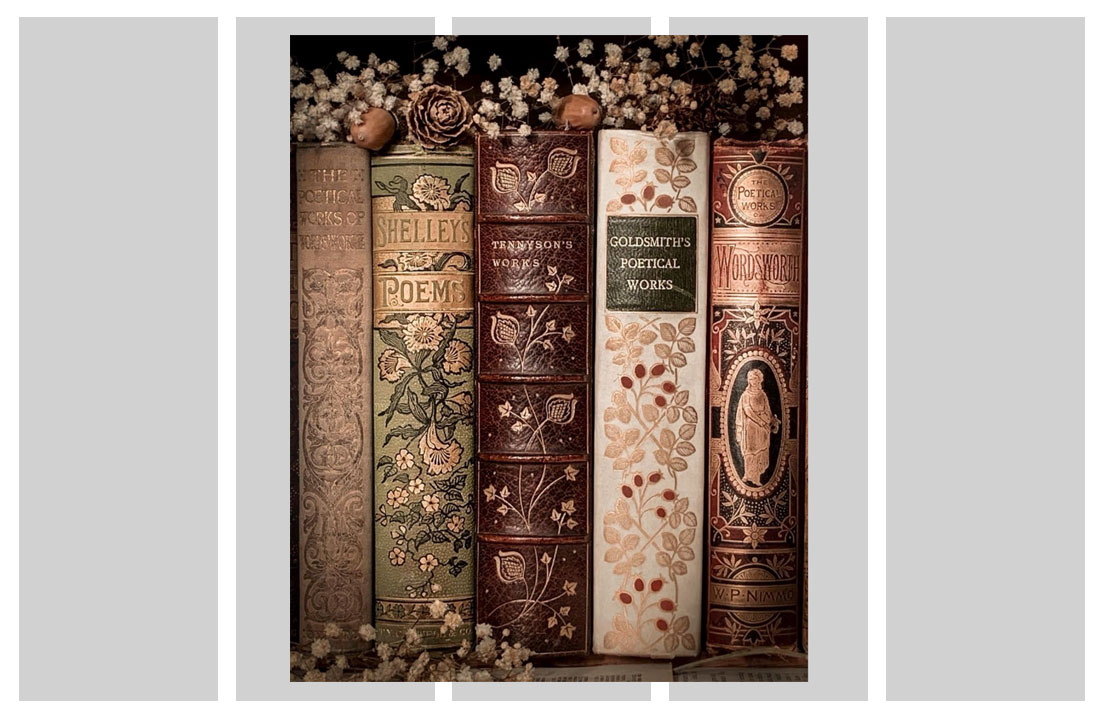
This is the photo I chose to gather inspiration from, already inserted into my Procreate canvas:
Here’s how my color palette is looking so far, after I picked some colors from the photo I chose before:
How to make sure all colors of your color palette work together
I think this is how the color palette really comes alive. You have to make sure that all the colors that you chose work together. To do that, we have to select each color and add them on top of each other. Just create a small rectangle on top of each color and then keep adding the colors inside each rectangle. You only need to add 4 rows of rectangles on each color.
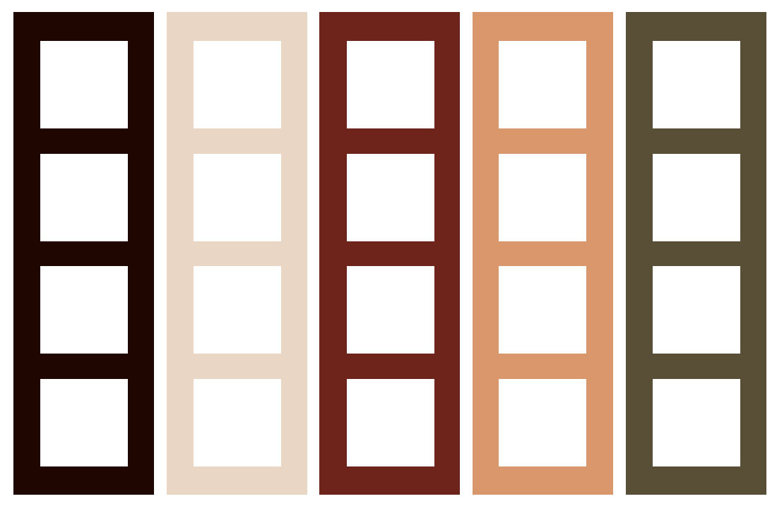
After you’ve finished adding all the rectangles on top of each color, you can star filling those rectangles! For each color, you’ll add the other 4 colors on top of it. For example, for the dark color you only need to fill in the light, accent and secondary colors. Take a look at how my colors are looking together so far:
Tip: Add all the same colors in one layer. For example, all the rectangles with the darker color should be in the same layer. Because if they’re in the same layer, when you’re changing the color, you’ll be able to change all of them at the same time. To do that, tap on the layer and select Alpha Lock. Then, tap on the layer again and with your color selected already, tap on Fill Layer. All of your colors will change automatically.
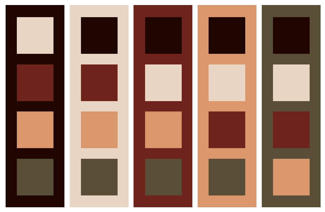
Once you’ve put all the colors together, you can get a sense of how they’re working with each other. Does anything feel odd to you? Is any color shining too bright over each other? If anything feels off at all, this is your time to mark what’s wrong and get ready to fix it.
There will be times when you won’t have anything to fix out of pure luck. But most times you’ll probably have to fix a thing or two. If you feel like any colors aren’t working against one another, it’s time to play with the color wheel or with the HSB and RGB sliders.
This is when you’ll start to play with the colors to fix anything that may seem odd. You can either play with the hue, saturation or brightness to make sure all the colors are working well together. Keep changing the colors until you’re satisfied with your color palette.
You can either change the color’s brightness or change the saturation to higher or lower. At this point, you’re really just playing with the colors until you see it fits better.
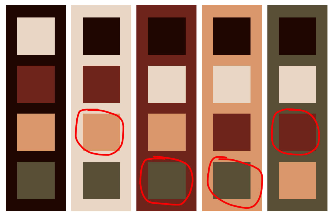
For my color palette, I felt like some colors weren’t working that well when I put them together. It seemed like some of the colors needed a bit of tweaking. So I started playing with the colors to see which ones could be improved. I thought that the accent color was too dark, so I changed it. The secondary colors also need a bit of tweaking.
At this point, it’s all about your eyes. You can keep working on the colors until you feel satisfied with the results. For me, this is what I came up with:
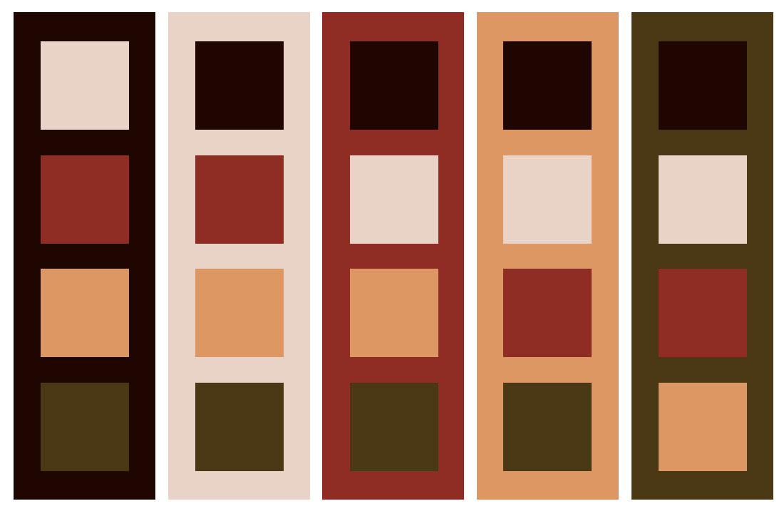
And that’s all! You already have a perfect color palette to use on your pieces. So now let’s see how we can apply it to a piece.
Using your color palette on a piece
So now that you have your palette, the next step is to apply it to a piece of artwork. The first thing I’ll do is a little color-blocking. Before I begin filling the final piece, I’ll quickly fill in the colors just so I can have an idea of how the colors are working in the artwork I’m finishing. This is not supposed to be perfect, it’s simply a fast way for us to look at how the colors will work within our piece.
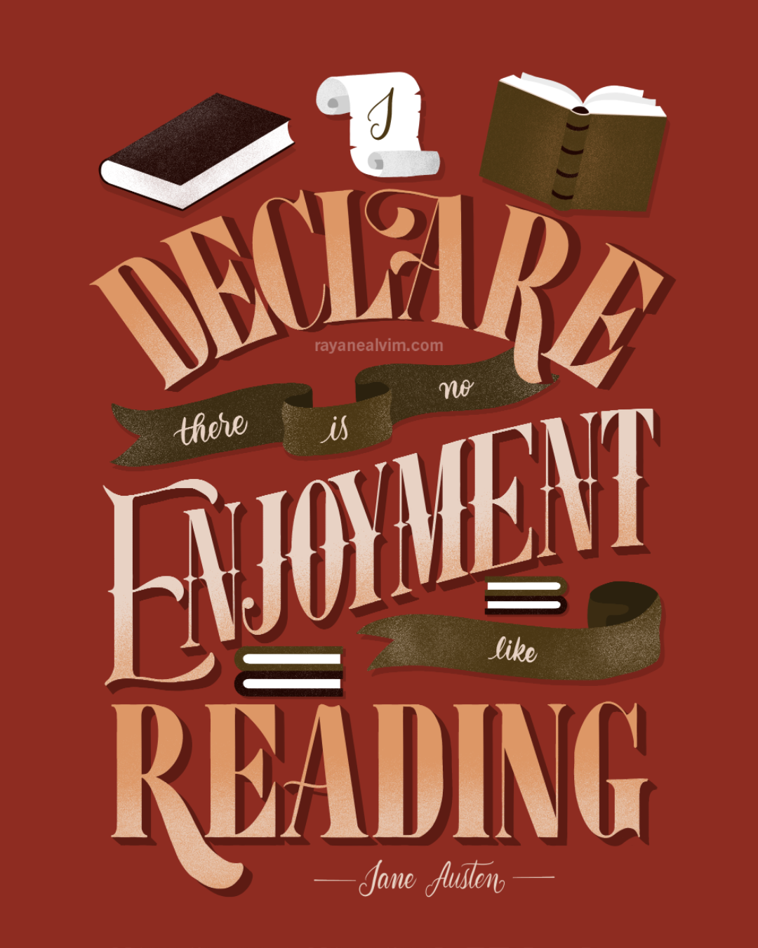
For my Bookaholic Series, I wanted to letter the phrase “I declare there’s no enjoyment like reading”, which is a quote from the book ‘Pride and Prejudice’ by Jane Austen. Since this is a quote from a book I adore and the book is from 1813, I really felt like I should add some cozy and vintage vibes to it. Because that’s how the book and this quote feel to me (and I know this quote has been taken out of context on the internet and it was said ironically in the book, but I love it anyway and I think we can assign a different meaning if we want to, right? I would also like to think that Jane Austen also felt this way since she was also an avid reader!)
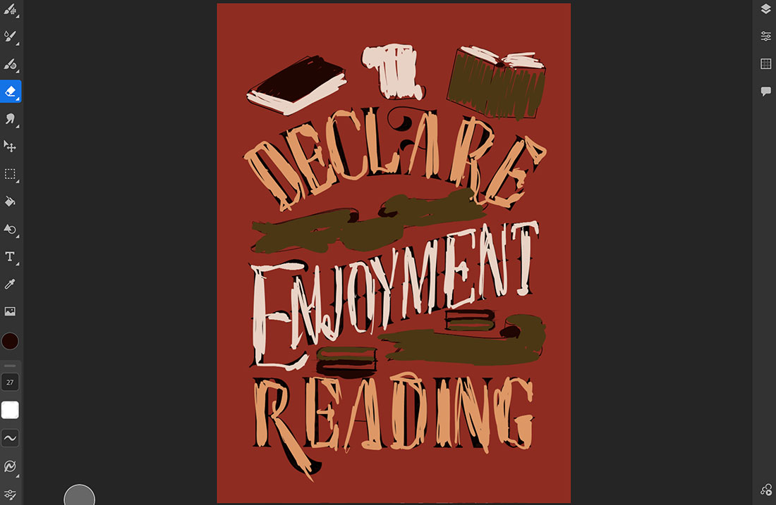
After I have a clear idea of how the colors are working within my artwork, that’s when I begin to fill in the final art. I’ll keep my color-blocking in a different layer so I can have it as a reference once I’m filling everything. Here’s how my final piece turned out:
Are you ready to create your own color palette now? Now that you learned how to create a color palette from a photo, make sure to share your creations with me or ask any questions about it in the comments section below! I’ll be more than happy to help.


