
Getting better at hand lettering takes time and a lot of practice. Sometimes when you’re drawing letters and something feels kinda off, that probably means you’re missing something. There are things you need to do for your letters to look right. You have to fix them optically so your hand lettering looks visually good. Previously, we learned how to fix mistakes in your serif letters. Now you’ll learn how to draw better sans serif letters.
There are many things we don’t notice in certain letters unless you’re really looking at them and studying them. With sans serif letters, some things need to be adjusted so that they look visually and optically correct. For example, when we’re dealing with mono weight letters, the weight needs to be slightly different when it’s a vertical stroke or a horizontal/diagonal stroke.
If you are struggling to draw letters or feeling like there’s something off with the way you’re drawing them, you don’t have to worry anymore! I’ve gathered together some tips on how to draw better sans serif letters. These tips are going to help you improve your hand lettering skills and draw better sans serif letters.
How to draw better sans serif letters: Letter ‘B’
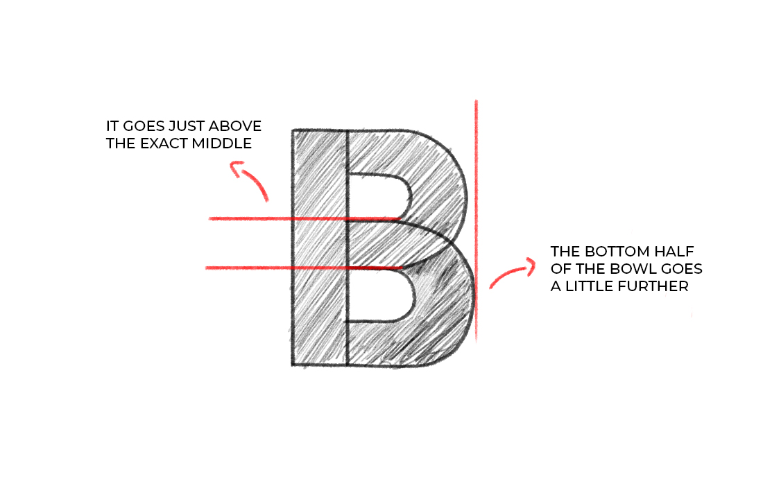
When drawing the letter B, the top bowl of the letter should be slightly smaller than the bottom bowl. The middle of the letter isn’t exactly in the middle. The letter shouldn’t be divided perfectly, the middle should go just above the exact middle.
How to draw better sans serif letters: Letter ‘E’
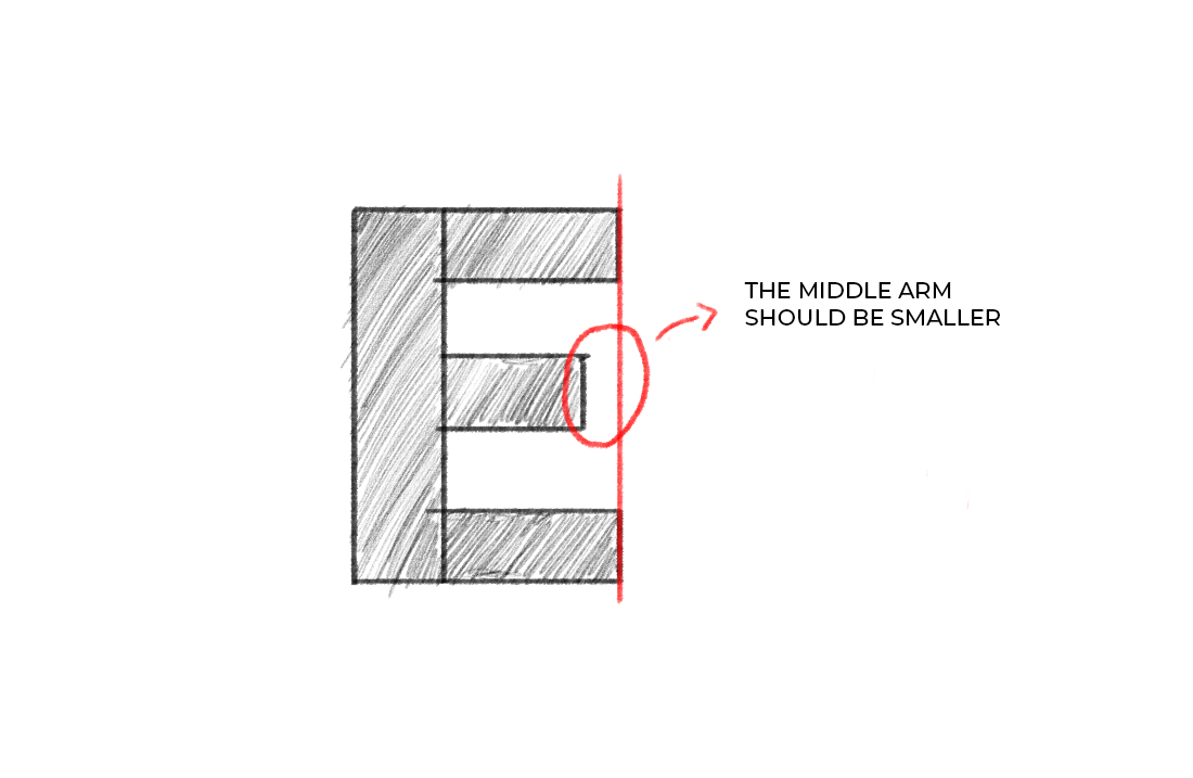
For the letter ‘E’, the middle arm should be shorter than the top and the bottom arms. This is because optically, it will look like the middle arm is a bit longer than the other two. The weight of the arms should also be a bit thinner than the weight of the stem.
Letter ‘H’
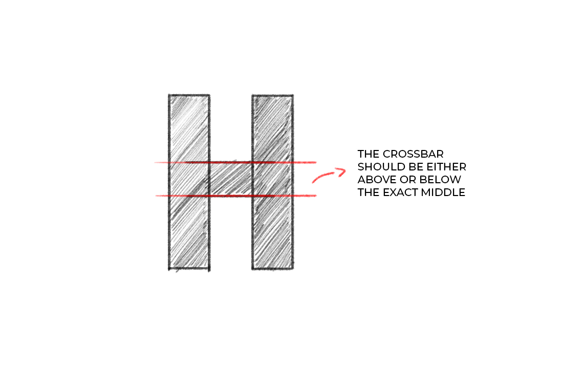
With the letter H, the crossbar should be drawn just above the exact middle. The weight of the crossbar should also be slightly smaller than the stem’s weight. Optically, it will look like they have the same weight!
Letter ‘R’
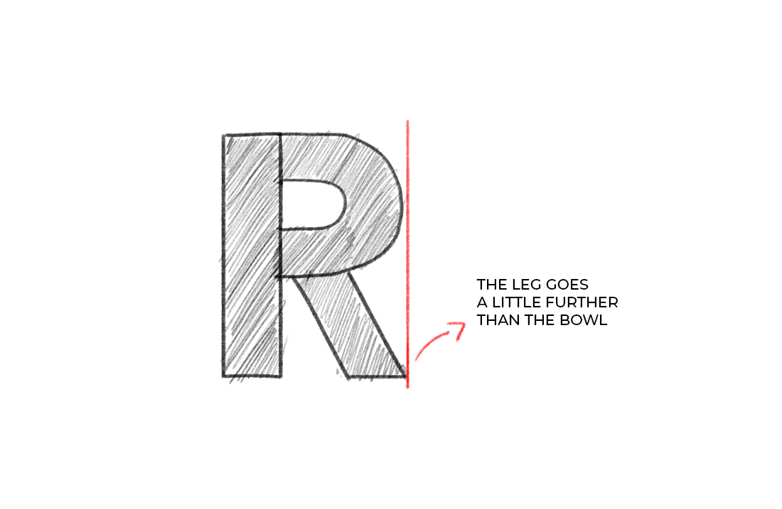
The leg of the letter R should go a little further than the bowl. The weight of the letter should also be slightly thicker than the weight of the stem. The bow should also be slightly thinner than the stem.
Letter ‘S’
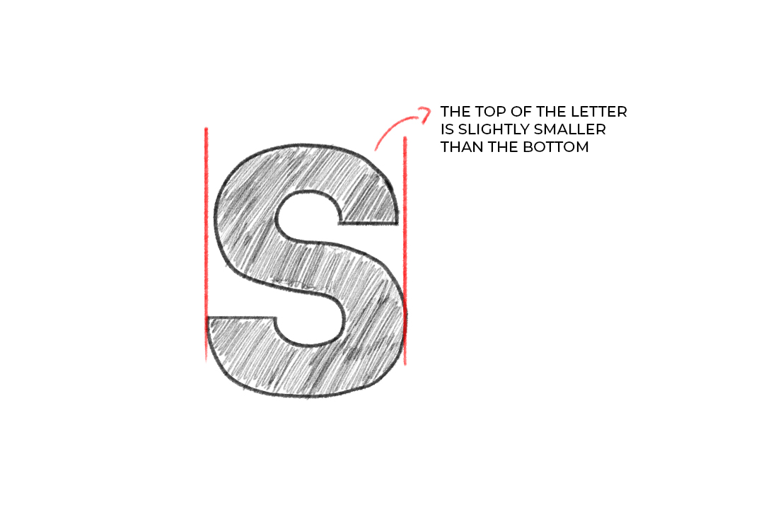
The letter ‘S’ is one of the most challenging letters to draw. I think most hand letterers would agree that it’s the letter that they hate the most! So for the letter ‘S’, the top half of the letter should be slightly narrower than the bottom half. Also, the top and the bottom curves should have a slightly thinner weight than the rest of the letter.
Why do we need to adjust the weight of the letters?
We need to adjust the weight of certain parts of the letters because optically it will look like they have the same weight. But if we take a closer look, we can see that the weights are just a little bit different.


