
I think one of the wonders about hand lettering is that you can actually do stuff that you normally wouldn’t do with a font. You can create different compositions, ligatures, illustrative letters and a lot of things that you probably wouldn’t have the creative freedom to do so if you’re using a typeface.
With that being said, I think that a lot of people go into hand lettering without actually studying typography, without actually knowing about the anatomy of a letter. So they just jump right into it without really understanding it. And just like you have to study anatomy to be able to really draw figures (before you can break the rules), with hand lettering it’s kind of the same thing. You have to study the letterforms to be able to draw them better.
I see a lot of people making the same hand lettering mistakes over and over again. I’m not just talking about beginners, I also see many experienced people making those same mistakes. I’m not saying that you have to follow every rule of typography in your hand lettering pieces – but like Picasso said: “Learn the rules like a pro, so you can break them like an artist”. You have to learn them before you can actually make modifications to your letters. In this post, I’ll show you the top eight hand lettering mistakes I see all the time and how to fix them.
Hand Lettering Mistake #1: Letter A
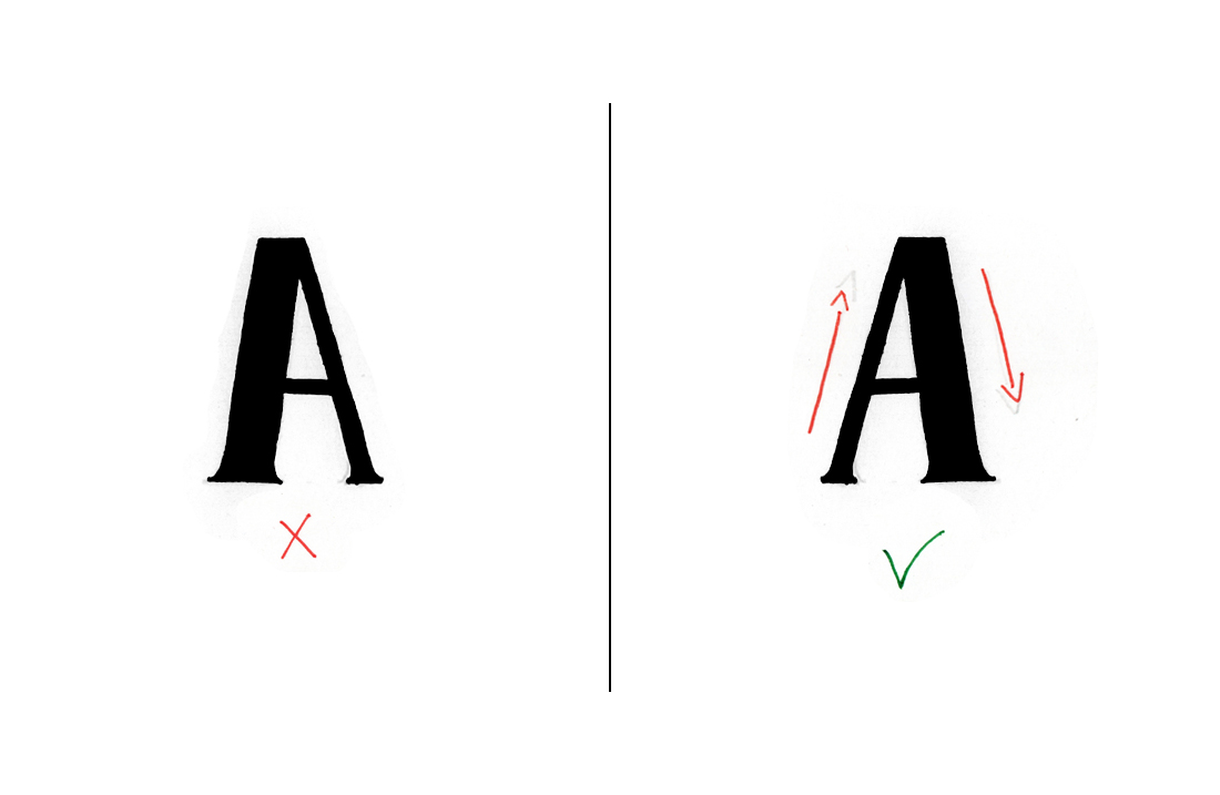
This one of the most common mistakes I see around the internet. The hairline, which is the thinner stroke of the letter A, should be on the left side, not on the right side. And the thicker stroke should be on the right side.
#2: Letter D
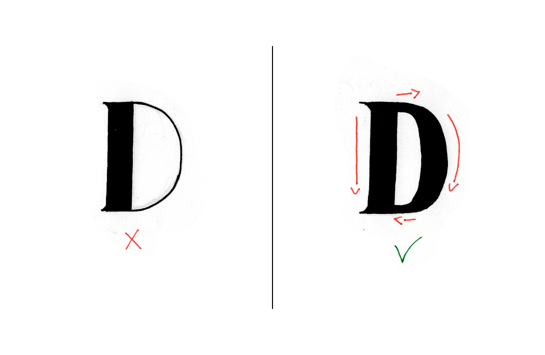
With the letter D, the main stoke should be thicker and the bowl should be thicker on the sides and thinner in the transitions or connections with the stem.
#3: Letter H
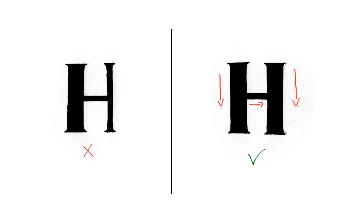
I see a lot of people drawing the letter H with a heavy left stroke and a lighter right stroke. This is not actually right, you can tell that something is off. What you should do to fix it is that the two strokes should be thick and the crossbar should be thin.
#4: Letter K
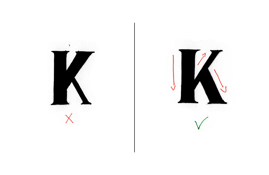
I see people drawing the letter K in two different ways. They either draw the leg as a thin stroke or they make all the strokes and the leg the same width. To fix this, you need to draw the stem (or the main stroke) and the leg as heavy strokes and the diagonal stroke should be thin.
#5: Letter M
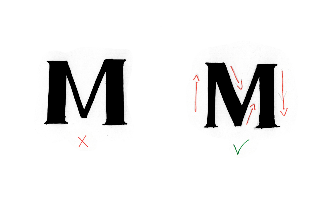
The letter M is one that people get so confused about. They usually don’t know where the heavy strokes should be. So, they draw the left and the right stroke as heavy strokes. But that’s not actually where the thick strokes go. The M has two heavy strokes and two thin hairlines. You just need to remember if the strokes go up or down, just like you do with calligraphy. The first stroke is up (thin), then down (thick) and then up and down again.
#6: Letter N
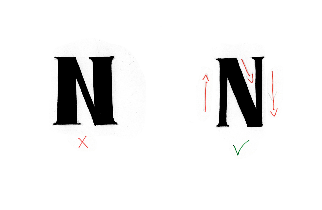
The letter N is really similar to the letter M. It is the same principle: the first stroke (hairline) goes up, the second stroke goes down. And the final stroke goes up again.
#7: Letter O
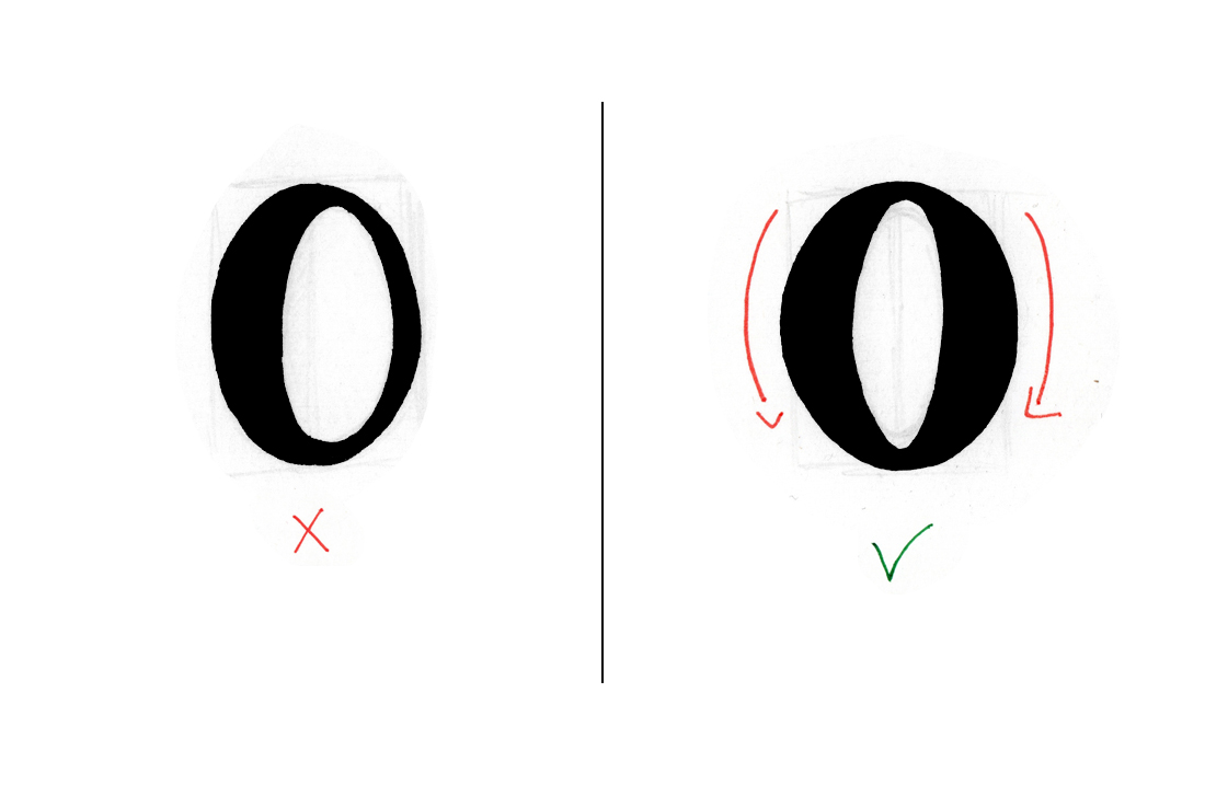
This a tricky one because when you’re doing script calligraphy, the first stroke of the letter O goes down and then up. But in the case of sans serif with width contrast or serif, both sides of the oval letter are going to be thick. And the transitions are going to be thin.
#8: Letter W
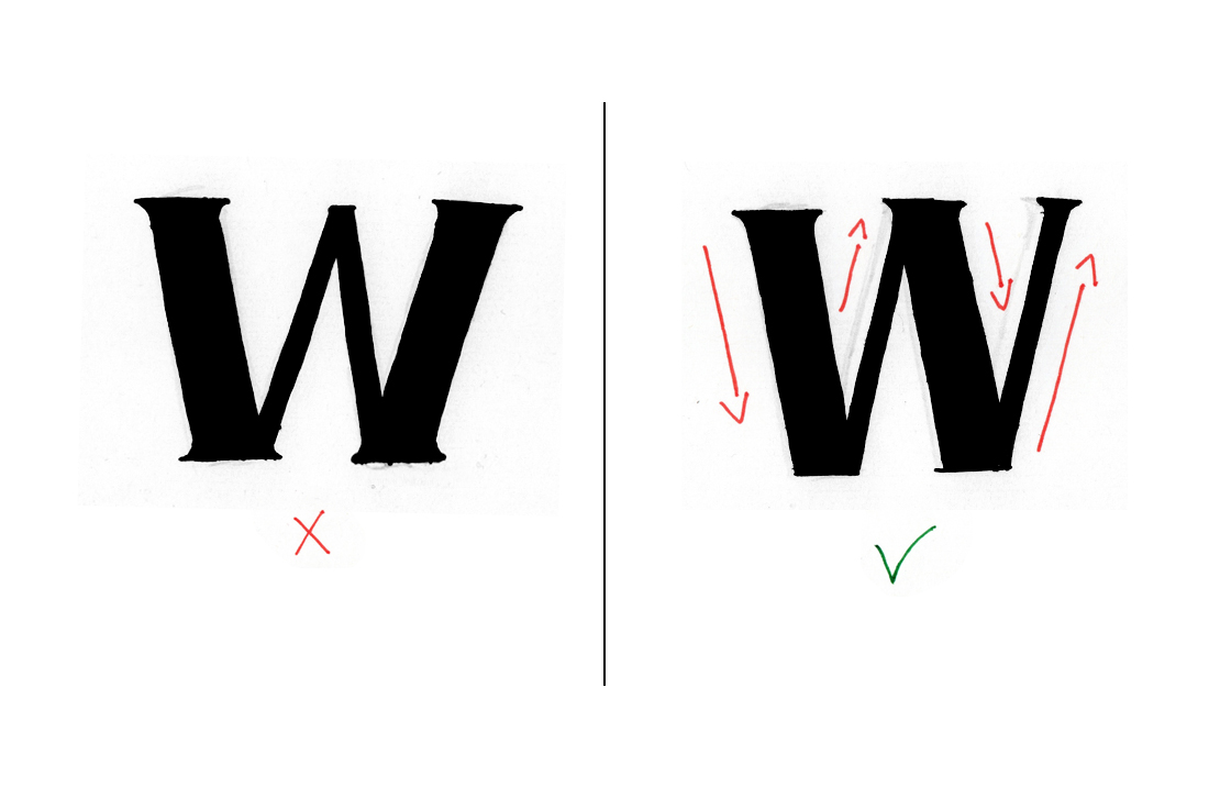
The letter W is also very similar to the letter M. I see people drawing heavy left and right strokes all the time. In the case of the letter W, the first stroke goes down, then up, down and up again.


2 Comments
What is the best way to know if I’m holding my pen the right way? The only way I have read that seemed to make sense was if your pen makes a sideways tear drop?
Hi Lisa!
I’m assuming you’re talking about how to hold a brush pen, right? If that’s what you’re talking about, holding a brush pen at an angle is what works best for me (and for the pen as well). I’ve talked about it a little bit in this post right here. Even though I was talking about Crayola markers, it also applies to brush pens. I always hold them at an angle a little bit to my right, but that might look a little bit different for everyone. But if you’re talking about any other pen (such as a Sakura Pigma Micron Pen, which I used for this post) there’s really no right or wrong here. It all comes down to what’s best and more comfortable for you.